H is for hardware...No, not hardware stores (although they can be a treasure trove), but hardware as in door knobs, cabinetry pulls, handles and knobs, even plumbing fixtures...the mechanics of the home that disguise themselves as jewellry. I hate going into a new home where the contractor has chosen everything, and the "jewellry" is missing. It seems like they either cheap out, or just don't have any style sense. Either way, it's up to us to tweak what needs tweaking and add our own jewellry. Nowadays, you can have your pick from vintage/reproduction style hardware in milk glass, antique metals, glass knobs... to the other end of the spectrum: modern finishes and styles. All can add up to a cheap, easy way to update and beautify doors, cabinets, bathroom fittings, and more.
 I is for inspiration...
Find a look, object, piece of art or even a colour that you find inspiring and let it be a jump-off point for everything else. Take the best from your inspirational item and make sure that when you choose something for your home because of it, the new item should make you feel as good as the inspirational piece.
 J is for journey...
 Decorating is a process and should be fun and drawn out. There are those who can afford to pay people to make everything come together at once. All is completed and perfect and they can purchase all the "right" pieces as soon as the
want enters their mind. While I am prone to a bit of envy towards those folks, I would not choose that route for the interior of my home. My style is constantly evolving. It is like a puzzle...I find something I like and it either fits or it doesn't. If it doesn't, I move on to something that "fits" better and I know that something better WILL always come along. I enjoy this journey as I create a space that I love... that isn't impulsive or just in vogue at the moment. I don't have the luxury of an unlimited budget, but I do have the luxury of an unlimited imagination, as do you. I dream it and try and find a way to create it on my budget. And if it doesn't happen, then it wasn't meant to be...and I move on to another piece of my puzzle. Let your home evolve. Your style will have more longevity that way...
K is for kitchen... I love a good kitchen. It is the first room I click on when I am perusing real-estate online. If the kitchen is good, I know the rest will also be good. Renovating a kitchen can be hugely expensive, so that is where your creativity comes in. Let paint, hardware, accessories, and lighting be your friend. One of the most creative fixes in a kitchen was done by
Cindy at Romantic Home. Pure genius at work...and a great way to beautify on a budget! I forget where I found this kitchen (below), but it is a great example of the homeowner choosing longevity over trends... beautiful!!
 L is for lighting...
I've droned on and on about my love of lighting and the absolute necessity of not overlooking its importance. It truly doesn't have to be expensive. Think classic good looks combined with a bit of the unexpected. You really
do deserve a chandelier in your bathroom or bedroom, and exterior lighting is not meant to be solely used outside. Select only lights that you
love and you will elevate your home to a new level.

M is for mouldings... I am talking about not only trim, but wainscotting, beadboard, raised and recessed panelling, etc. Especially in new homes, this brings an element of architecture to rooms. Wide baseboards and deep window headers are particularily beautiful and will add real style to your home.

N is for natural... Decorate in YOUR style. It's okay to get inspiration from a magazine or design book, but when you find yourself obsessed about replicating every detail in the photo, then you know you have lost your way. Your house won't feel like yours if you strip away your treasured belongings just because they don't fit in perfectly with your desired decorating scheme. Show a little of yourself...be inspired by others but don't be a copy-cat. This leads to my next point...

O is for originality... I have two things to say about that. Inject some originality into your space...but don't believe your hype. While others may tell you that you are the most creative person on the planet, and you likely are extremely creative, we all have to own up to the fact that we've likely seen the idea elsewhere. Whether it be at someone else's home, in a magazine, on HGTV, or some other random spot. We may not consciously recall where the idea originated, but very likely someone, somewhere has had the idea first...albeit perhaps way down the creative ladder.
I know of someone who would spot a great idea in a newly released magazine and announce that they were going to do "this, this, that and this". Therefore, the rest of the world who would have purchased the magazine would be copying if they decided to carry out the ideas as well (I bet you're nodding in agreement...we all know someone like that!). Remember, it is easy to recreate a great look, but to truly make it your own and even better than the original, infuse some of your own personal style and belongings into the look.

P is for paint!! The dreaded decision...which colour to paint our rooms can drive us all batty. We are so scared to make a bad colour choice...or even worse, to make a mediocre choice that we will live with because it isn't offensive; but we hate it all the same because we're angry at ourselves for
playing it safe. If you want my advice on selecting paint colour, check out this old post about
choosing colour wisely.
I've got some tough letters up ahead...Q and U and X and Z...I better go ask my kids for some advice on what starts with those letters. I'm pretty sure I can't convince you to hang X-ray photos up on your wall and you certainly can't place a vase on an Xylophone...Aagh!! I'll see what I can some up with!!
 Print this page
 photo: Pottery Barn


 By the way, if you thought of something for the letter X, tell me!! I hereby X-tend my apologies and can offer no X-cuse for my lack of creativity!!!
 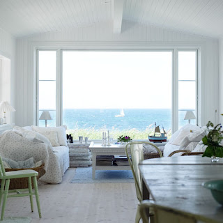 Don't you love that song?? Every toddler warbles the words (and letters) out in such a sweet way, all the while learning their alphabet!! Well, on with my version...the decorating ABC's!


