Jamie Drake
Can I just state on the record how excited I am that purple is starting to creep it's way back in style (both in fashion and in home decor)? I've long been a fan of purple, in all its many forms (though particularly in its richer, jewel-tones of plum and aubergine), and it's been frustrating trying to incorporate the color into the decor of our new house as there are precious few options in the hue. But, as I see more and more purple popping up in interiors magazines, I feel confident that is in the process of changing and that in a year or so purple will be as prevalent as yellow and turquoise are today.
Jamie Drake
When I saw this gorgeous guest room designed by Jamie Drake and featured in the most recent Traditional Home (see HERE to check out the entire house) I was instantly in love. I absolutely adore how Jamie so beautifully incorporated several shades of purple. The fact that the purples don't precisely match makes the room all the more appealing to me and works particularly well with the Moroccan touches (that trio of lanterns above the bed and the mirror featured in the reading nook above are particularly eye catching). I also like the lavender grass cloth, which brings so much texture and visual interest in the room. Drake papered the low, slanted ceilings as well, which is a great way to help visually erase those awkward angles.
This bedroom was featured on the cover of Sixx Design's recently published book(which is a great read by the way) and for good reason: it's gorgeous. I love the gorgeous fabric used on both the bed and curtains, especially juxtaposted against that rug.
Canadian House & Home
While purple isn't the dominant color in this room, it's certainly the pop of color needed to really turn up the volume in this otherwise neutral room. Again, there's a vaguely Moroccan feel to this space and I think the color works really well with the rich golds and browns the style often incorporates. Moreover, the intricate patterns and fretwork that are hallmarks of Moroccan style are a natural pairing to purple as purple only serves to heighten the sense of luxury, drama and richness that this look is famous for.
Kishani Perera
I love this office designed by LA designer Kishani Perera. Again, lavender walls act almost as a neutral with bolder iterations of purple working as accents. The chartreuse is a nice balance to the purple. As yellow-green is the opposite of purple (or red-blue) on the color wheel, the pairing is particularly attractive and a fresh, modern take on the traditional purple-yellow.
Katie Ridder
Just a pretty, pretty room. The modern art helps take the sweetness off while the giant arrangement of cherry blossoms lends a less structured, more organic feel to the traditional room.
Lindsay Coral Harper
Again with the Moroccan vibe and chartreuse pairing (okay so the headboard reads as a little more of an apple green, but still!). I love the deep, rich aubergine of the walls; the cocooning effect of dark walls in a bedroom can be incredibly calming and it's a great backdrop for the brighter headboard (and it's incredible shape!).
Chartreuse and purple strike again, this time in the very capable hands of Amanda Nisbet. My favorite feature in the room is the bolder plum band right underneath the crown molding. Nisbet repeats the crispness of this trim in the trim on the white linens. Such a great accent on the space and a great alternative if you don't want to wash the walls in a dark color. I also like how Amanda has hung the art straight up to the ceiling and around the headboard, which is incorporated into the arrangement as art in and of itself.
Kishani Perera
The wall colors in this bedroom are masterful -- and easily replicated by painting the same color in three different shades. To maximize ceiling heights, paint the darkest color on bottom and the lightest on the ceiling. Since the walls should be the stars here, Kishani rightly kept the rest of the room relatively neutral, with fresh white bedding and white furniture and accessories. The pale lavender rug echoes the pale lavender on the ceiling and helps create a pleasing symmetry.
Again, a predominately neutral space with purple accents. In reality, the only purple items are the modified wing back chair and the lamp shade, with the rest of the room awash in whites, gray and beiges.
Katie Ridder
Love, love, love this office. The walls are so gorgeous and, while I usually prefer white molding, the nearly tone-on-tone lilacs are spot-on as a greater contrast would have made this way too busy. The zebra rug is a great addition here, too, as it ups the glam factor and adds a jolt of pattern that's a nice contrast to the grid created by the molding.
 Print this page
 Modern and elegant TV Stand Furniture design
 Modern and elegant TV Stand Furniture design
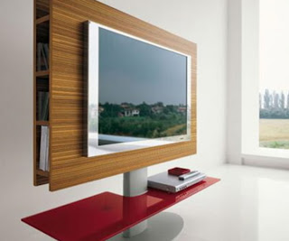 Modern and elegant TV Stand Furniture design


